The first principle is that you must not fool yourself, and you are the easiest person to fool.
Richard P. Feynman, Cargo Cult Science (1974)
NoteWhy this chapter exists
The book’s treatment of ethics has so far been entirely regulatory. Chapter 33 covers what the funders require, Chapter 3 covers what the HIPAA Privacy Rule requires, and Chapter 25 covers what the FDA requires. All three are necessary and none is sufficient, because an analysis can satisfy every one of them and still mislead every reader it reaches. This chapter is about the failures that compliance does not prevent, and about which the statistician, not the institutional review board, is the last line of defense.
34.1 Prerequisites
Answer the following questions to see if you can bypass this chapter. You can find the answers at the end of the chapter in Section 34.15.
A dataset is assembled entirely from information that individuals published about themselves in public. Explain how releasing it can nonetheless harm them.
Two group means have 95% confidence intervals that overlap. May you conclude that the groups do not differ significantly?
Name three ways a figure can mislead a reader without containing a single false number.
34.2 Learning objectives
By the end of this chapter you should be able to:
Distinguish the harm of disclosure from the harm of aggregation, and recognize that public data can carry the second without the first.
Identify causal language attached to associational evidence, in your own writing and in the manuscripts you review.
Recognize the standard visual distortions: the truncated axis, the area-for-quantity encoding, and the dual axis.
Demonstrate why overlapping confidence intervals do not imply a non-significant difference, and stop making the inference.
Distinguish a sample from the target population, and state the groups to which an estimate does and does not transport.
Locate where in the workflow each of these failures is introduced, and where it can be caught.
34.3 Orientation
The regulatory chapters of this book describe a floor. They tell you what you must not do: release identifiers, skip the data-management plan, submit a dataset that fails conformance. Clearing that floor is a necessary condition for defensible practice, and it is nowhere near a sufficient one. The floor is written in terms of procedures, and the failures that matter most are failures of inference.
Five such failures recur in biomedical work, and they have a common structure: at no point does anyone state a falsehood. The data are real, the computation is correct, the p-value is what the software returned, the figure plots the numbers it claims to plot. The misleading happens in the gap between what was computed and what the reader concludes. It is precisely in that gap that the statistician’s professional obligation lives, because the statistician is the only person on the team who can see the gap at all.
34.4 The statistician’s contribution
This chapter is judgment from beginning to end.
You are the last person who can catch this. The clinical collaborator cannot evaluate whether the confidence interval supports the sentence in the abstract; that is why they have you. The reviewer may or may not look. The reader certainly will not. When the press release says ‘exercise prevents cancer’ and your analysis found an association in an observational cohort of volunteers, you are not a bystander to that sentence. You are its last opportunity.
Public is not the same as consented, and available is not the same as ethical. The question ‘may I’ has a legal answer and an ethical one, and they are different questions. A dataset that violates no rule can still hurt the people in it. Ask what happens to a person in your data if the analysis is right, and then ask what happens if it is wrong.
Distortion is usually accidental, which does not make it harmless. Almost nobody sets out to deceive with a truncated axis. They set out to make the effect visible, and a truncated axis makes it visible. The reader who glances at the figure then carries away an impression the data do not support. Intent is not the standard. The standard is what a competent reader would conclude.
Refusing is part of the job. There is a point at which the correct professional act is to decline: to refuse to sign the manuscript, to refuse to produce the figure as specified, to say that the analysis as requested is not one you will perform. Chapter 4 distinguishes preference from principle precisely so that you spend your credibility on the cases where this matters. This chapter is the catalog of those cases.
34.5 Aggregation harm
The first failure concerns data that were never private.
In 2016 a group of researchers released a dataset of some 70,000 profiles scraped from a dating website, including usernames alongside answers to intimate questions about sexuality, drug use, and political views. The defense offered was that the data ‘are already publicly available’, which was true and beside the point. Each user had disclosed a fact to an audience of their choosing, in a context they understood. The release did something none of them had chosen: it collected those disclosures into a single, searchable, permanent, downloadable artifact, and attached them to identifiers.
This is aggregation harm, and it is the same phenomenon that Chapter 3 treats formally under the heading of quasi-identifiers, arriving from the other direction. There, the point was that no single ordinary variable identifies anyone but their conjunction can. Here, the point is that no single disclosure harms anyone but their conjunction can. The mathematics is the mathematics of joint distributions; the ethics is the ethics of context. Information carries with it an implicit expectation about where it will travel, and moving it somewhere else is an act with consequences even when every individual datum was freely given.
The practical tests, before you assemble a dataset from public sources:
Would the people in it be surprised? Not ‘would they object’, which invites you to answer for them, but ‘would they be surprised to find themselves in it’. Surprise is a reliable signal that a contextual expectation is being violated.
Does the aggregate reveal what the parts did not? Someone who posted in a support forum has disclosed a health condition to that forum. A dataset linking forum posts to employer names has disclosed it to their employer.
Can it be de-identified without destroying the analysis? If yes, do that (Chapter 3). If no, that is informative: it means the identifiers are load-bearing, and you should be able to say why.
NoteCheck your understanding: everything was already public
Question. A colleague assembles a dataset entirely from public sources: forum posts, a professional registry, and voter rolls. Nothing was obtained without permission and nothing was private. They argue no ethical review is needed because they disclosed nothing new. Where does the argument fail?
Answer.
It treats disclosure as a property of each field rather than of the combination, and the harm is entirely in the combination.
A forum post about a health condition is public to that forum’s readers. A registry entry is public to people looking up practitioners. Voter rolls are public to anyone who asks. Each disclosure has an implicit audience, and the people in the data chose exposure to that audience.
Joining them creates a fact that existed nowhere before: this named person, at this address, has this condition. Nobody consented to that, because it was not available to consent to. The keys that make the join possible are exactly the quasi-identifiers of Chapter 3, and this is the aggregation version of the same mechanism.
The second failure is that ‘public’ describes access, not permission. Publicly readable data still carries terms of use, and scraping is a distinct act from reading. The practical test is the one this section gives: could you tell the people in your dataset what you built, and would they recognize it as something they agreed to?
Note also what this argument implies for the ethics of review itself. If assembling it needs no review because each piece was public, then no aggregation ever needs review, which is a conclusion nobody defends when stated plainly.
34.6 Causal overclaiming
The second failure is the most common one in biomedical publishing, and it usually happens in the last paragraph.
An observational cohort of self-selected volunteers reports that those who exercised more had lower cancer incidence, adjusting for age, sex, smoking, and body-mass index. The finding is an association. The discussion section says the finding ‘suggests that exercise reduces cancer risk’. The press office says exercise prevents cancer. The newspaper says it cures it. At no step did anyone fabricate a number.
The statistician’s job is to insist that the verb match the design. The three registers, from Chapter 4, are worth restating as a hierarchy of claims:
Design
What you may say
Randomized, adequately powered, pre-specified
’X reduced Y by \(\delta\)’
Observational, well adjusted, no unmeasured confounding assumed
‘X was associated with lower Y; the association is consistent with a causal effect but the design cannot establish one’
‘Among volunteers who reported X, Y was lower. Volunteers who exercise differ from those who do not in ways we did not measure.’
The third row is the one to keep in view. The problem with a volunteer cohort reporting its own exercise is not that the confounder adjustment was inadequate. It is that people who exercise and report it differ systematically from people who do not, along dimensions (conscientiousness, health-seeking behavior, unmeasured comorbidity, the very early symptoms of undiagnosed disease) that no covariate list captures. The adjustment cannot fix this, and stating that you adjusted for age and smoking implies to a reader that it did.
The specific place this fails is the transition from Results to Discussion, where the verb changes from ‘was associated with’ to ‘reduces’ without anyone noticing. Read your own discussion section as a hostile reviewer, and grep for causal verbs: reduces, prevents, protects, causes, leads to, improves. Each one is a claim your design must license.
34.7 Visual misrepresentation
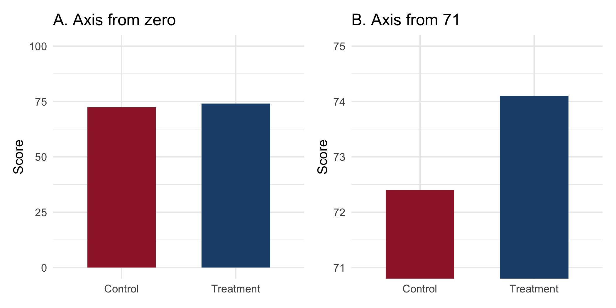
The third failure needs no numbers at all, only their encoding. The figure below plots the same two group means twice.
Figure 34.1: The same two means, encoded twice. Panel A begins the y-axis at zero and the difference is what it is: small. Panel B begins the axis at 71 and the same difference fills the panel. Neither panel contains a false number, and a reader who glances at B carries away a conclusion the data do not support.
The difference is 1.7 points on a 100-point scale. Panel A tells you that. Panel B tells you that the treatment arm is roughly three times the control arm, which is false, and it tells you so without printing a single incorrect value.
The three standard distortions:
The truncated axis. As above. The rule is not ‘always start at zero’, because for many quantities zero is meaningless (body temperature, calendar year, pH) and forcing it wastes the panel. The rule is that when the visual encoding is length or area, as in a bar chart, the baseline must be zero, because the reader is comparing lengths and a truncated bar’s length is not proportional to its value. For a point-and-interval plot, where the encoding is position rather than length, a truncated axis is legitimate and often necessary. The question is always: what is the reader’s eye measuring?
Area for quantity. A map colored by which arm won each county encodes land area, and land does not vote. A bubble whose radius is proportional to a count exaggerates it, because the eye reads area, which goes as the square of the radius. In biomedicine the recurring case is a map of disease counts that is really a map of where people live, and the fix is a rate, a denominator, and a cartogram or a population-weighted encoding.
The dual axis. Two series on two differently scaled y-axes can be made to cross, converge, or diverge at the analyst’s choice, because the relative scaling is arbitrary. Any apparent relationship between them is an artifact of a decision you made. Avoid dual axes entirely; if two series must be compared, index them to a common baseline or use two panels.
34.8 The overlapping-interval fallacy
The fourth failure is the one a biostatistician is most likely to commit personally, and it is a genuine technical error rather than a rhetorical one.
The reasoning goes: the 95% confidence intervals for the two group means overlap, therefore the difference is not significant at the 5% level. This is wrong, and it is wrong in the direction of missing real effects. The interval for a difference depends on the standard error of the difference, which is smaller than the sum of the two individual standard errors, and intervals for the two means can overlap substantially while the interval for their difference excludes zero.
A demonstration, on synthetic data constructed to make the point sharply:
set.seed(18)a<-rnorm(60, mean =100, sd =12)b<-rnorm(60, mean =105, sd =12)ci<-function(x){m<-mean(x)se<-sd(x)/sqrt(length(x))c(lower =m-1.96*se, mean =m, upper =m+1.96*se)}rbind(group_a =ci(a), group_b =ci(b))|>round(1)#> lower mean upper#> group_a 96.0 99.4 102.7#> group_b 101.7 104.3 106.9t.test(b, a)#> #> Welch Two Sample t-test#> #> data: b and a#> t = 2.289, df = 111.36, p-value = 0.02397#> alternative hypothesis: true difference in means is not equal to 0#> 95 percent confidence interval:#> 0.6621209 9.1959712#> sample estimates:#> mean of x mean of y #> 104.28772 99.35868
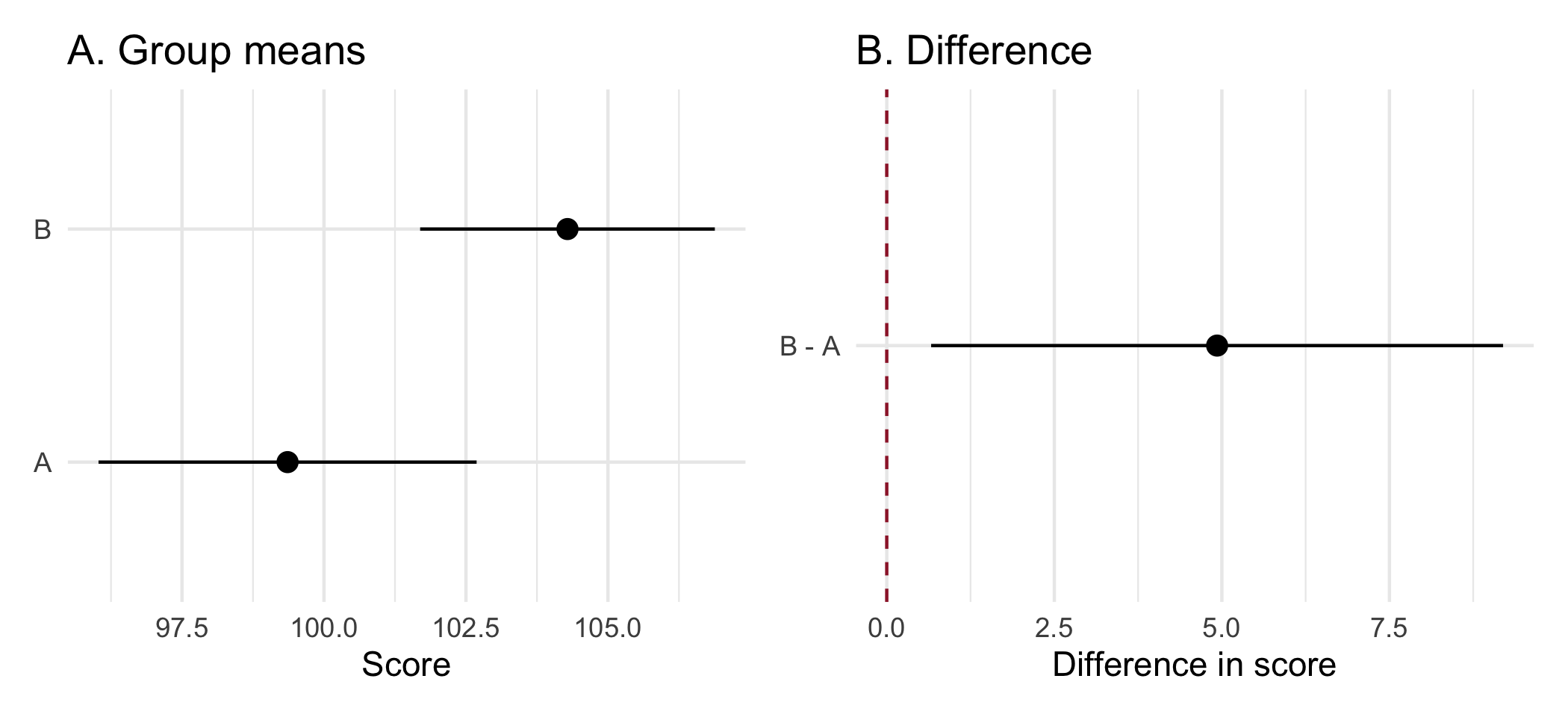
The two intervals overlap: group A reaches 102.7 and group B begins at 101.7. The two-sample test nonetheless rejects at the 5% level (\(p = 0.02\)). Anyone reading the overlap off a figure and concluding ‘no significant difference’ has reached the opposite conclusion from the one the data support.
The overlap here is about one point, which is deliberate: the fallacy does its damage in exactly this regime, where the intervals graze each other and the difference is real. As the difference grows the intervals separate and the two readings agree; as it shrinks the test stops rejecting and they agree again. It is the middle, where an analyst is most likely to be looking for guidance from the figure, that the overlap heuristic gets wrong.
Figure 34.2 shows why. The correct object to look at is not the pair of intervals but the interval for their difference, which is a different quantity and answers the question actually being asked.
Figure 34.2: Left: the two group means with their 95% intervals, which overlap. Right: the 95% interval for the difference, which excludes zero. These are not in conflict; they are answers to different questions. Reading significance off the overlap on the left is the error.
The practical consequences are two. When you report, give the interval for the contrast, not merely intervals for the arms, because the contrast is the estimand. When you review, treat any sentence of the form ‘the intervals overlapped, so the groups did not differ’ as an error, and say so.
34.9 Unrepresentative samples
The fifth failure is the one whose costs fall on people who are not in the room, and often not in the data. It is the failure of fair representation, and it is the reason a competent statistician asks who a sample contains before, not after, generalizing from it.
The structure is by now familiar. A cohort is assembled, an estimate is computed, and the estimate is valid for the population that was actually sampled. The falsehood, once again, is in no number; it is in the silent step from ‘this holds in the sample’ to ‘this holds’, taken when the sample and the target are not the same population and no one has said so. This book’s own source material shows the mechanism: the survey behind this chapter’s team-science reading drew respondents who were 82.8% White, and its authors state plainly that their conclusions may not transport to a more diverse workforce (Slade et al., 2023). The honesty is the model; the skew is the hazard.
A sample is evidence about the population it was drawn from, and no other. A drug trial that enrolls overwhelmingly at academic medical centers, among patients who can attend fortnightly visits, skews toward the younger, the insured, the urban, and the un-comorbid. The estimate it produces is an estimate for those patients. Applied to the elderly, rural, multiply-morbid patient to whom the drug will actually be prescribed, it is an extrapolation, and an extrapolation is a claim the data do not contain. Adjusting for age does not repair this, for the same reason it did not repair the volunteer cohort earlier in this chapter: the groups differ along dimensions no covariate list enumerates.
Under-representation is not a diversity checkbox; it is a bias-and-variance problem with a face. When a subgroup is a small fraction of the sample, two things hold at once. The estimate for that subgroup is imprecise, because its \(n\) is small, so a real effect specific to them is the effect you are least able to detect. And if the effect genuinely differs there, the pooled estimate, dominated by the majority, is biased for them in particular. A result reported as though it applied to everyone therefore fails exactly the people the sample underweighted, and fails them silently, because the interval on the pooled estimate looks reassuringly tight.
A model learns the sample’s inequities and returns them as findings. Where an analysis feeds a decision rule, a risk score, an eligibility threshold, a resource-allocation model, an unrepresentative or biased training sample is no longer merely imprecise; it is a mechanism for propagating the bias at scale. The canonical case is a health-system algorithm that used prior health-care spending as a proxy for health need and, because less had historically been spent on Black patients at equal levels of illness, systematically understated their need (Obermeyer et al., 2019). Every number was correctly computed. The proxy was the error, and only someone asking what the variable stood for could have caught it.
The practical discipline is threefold and cheap:
Report who is in the sample beside who the result is for. A Table 1 giving the demographic composition is the minimum, and the Discussion should name the populations to which the estimate does and does not transport. ‘Our cohort was 91% White and privately insured; generalization to other populations is unestablished’ is one sentence, and it is the honest one.
Pre-specify the subgroups you are powered to examine, and label the rest exploratory. This is the discipline of Chapter 24 applied to representation: a subgroup you were not powered for yields an imprecise estimate, not an absence of effect, and the report must say which it is.
When a variable feeds a decision, ask what it is a proxy for. Before a predictor enters a model that will act on people, ask whether it encodes a protected characteristic and whether the model’s errors are borne equally. This is the fairness audit, and it is cheap relative to the harm it averts.
Fair representation has a second face, downstream of the analysis: whether every reader can in fact read the result. A figure that carries its only distinction in red versus green is illegible to the roughly eight per cent of men with a red-green color-vision deficiency, and the fix, a color-blind-safe palette verified before publication, is treated concretely in Chapter 22. Accessibility of the artifact is the same principle as representativeness of the sample, arriving at the far end of the pipeline: a result that reaches only some of its readers, or speaks for only some of its subjects, is not the finished product it appears to be.
NoteCheck your understanding: the compliant misleading paper
Question. A paper reports an observational study. The IRB approved it, the data are properly de-identified under Safe Harbor, the DMSP is in place, the code is on Zenodo with a DOI, and every number in the paper is correctly computed from the data. The abstract concludes that the intervention ‘reduces 30-day readmission’. Has anything gone wrong?
Answer.
Yes, and nothing in the compliance apparatus was built to catch it. Every requirement in Chapter 33 and Chapter 3 is satisfied, the analysis is reproducible in the sense of Chapter 2, and the reported numbers are right. What is wrong is a verb: an observational design licenses ‘was associated with lower readmission’, not ‘reduces’. The distinction is not pedantry. A reader, a guideline committee, or a health system deciding where to spend money will act on ‘reduces’, and the evidence does not support the action.
Note what this implies about the rest of the book. Reproducibility, compliance, and correctness of computation are each necessary and they are jointly insufficient: a perfectly reproducible, fully compliant, numerically correct analysis can still mislead every reader it reaches. The tools cannot close that gap. Only the analyst can.
34.10 Where each failure is caught
The five failures enter the workflow at different points, which means they are caught at different points.
Study design and recruitment; sometimes acquisition
Reporting who was sampled beside who the result is for; a proxy audit before a model acts
None of them is caught by a test suite, a lockfile, or a container. That is the point of the chapter, and it is worth stating plainly: the entire infrastructural apparatus of this book is orthogonal to whether the analysis misleads. Reproducibility guarantees that a wrong conclusion can be regenerated exactly.
34.11 Collaborating with an LLM on ethical review
Models are useful here and dangerous in a specific way: they are agreeable, and every failure in this chapter is one an agreeable collaborator would let pass.
Prompt 1: auditing your own discussion section. Paste it and ask: ‘list every sentence whose verb implies causation, and for each, state what design would license it.’
What to watch for. This works well, because it is a text-classification task rather than a judgment. Expect a few false positives. The sentences it flags are the sentences a skeptical reviewer will flag.
Verification. For each flagged sentence, check the design against the table in this chapter. If the design is observational and the verb is causal, rewrite it.
Prompt 2: critiquing a figure. Describe the encoding (bar chart, y-axis from 71 to 75, two groups) and ask what a reader would wrongly conclude.
What to watch for. The model will identify the truncated baseline reliably. It is weaker on subtler distortions, such as an area encoding or an inappropriate denominator, because those require knowing what the quantity means.
Verification. Render the figure both ways, as this chapter does, and look at them side by side. The comparison is more persuasive than any critique.
Prompt 3: the one it will get wrong. Ask it whether you may release a dataset assembled from public profiles.
What to watch for. The model is likely to reason from legality, because legality is what is written down, and to conclude that public data may be republished. Push it: ask what harm a person in the dataset could suffer, and ask whether they would be surprised. The considerations exist in its training data but it will not volunteer them, and this is exactly the territory where an agreeable collaborator is worse than none.
Verification. Take the question to your IRB, and to a colleague who will tell you no.
34.12 Principle in use
Three habits stand between a compliant analysis and an honest one:
Match the verb to the design. Observational studies license association. If the discussion section says ‘reduces’, the design had better be randomized.
Ask what the reader’s eye is measuring. A bar encodes length, so its baseline is zero. A map encodes area, and land does not have a disease. A dual axis encodes an arbitrary choice you made.
Compliance is a floor, not a ceiling. Every regulatory requirement in this book can be satisfied by an analysis that misleads every reader it reaches. You are the only safeguard against that, and it is the part of the job no tool performs.
34.13 Exercises
Construct a dataset in which two group means have overlapping 95% intervals and a two-sample t-test rejects at the 5% level. State the largest overlap you can achieve while retaining significance, and explain the relationship between the standard error of a mean and the standard error of a difference.
On your own work. No answer key; these require a paper, a figure, or a colleague you supply.
Take the discussion section of a paper you have co-authored. List every causal verb. For each, state the design that would license it and the design you actually had. Rewrite any that fail.
Reproduce the truncated-axis figure in this chapter with data of your own. Show it to a colleague without comment and ask them to describe the effect size in words. Then show them the zero-baseline version and ask again.
Find a published figure in your field that encodes a quantity as area or uses a dual axis. Redraw it honestly. Write a paragraph on what changes.
Write a one-page policy, suitable for a research group, on when data assembled from public sources may be released. Include the questions you would require an analyst to answer before assembling such a dataset.
Take a published clinical study in your field and find its Table 1. Identify the demographic groups under-represented relative to the population the intervention is meant to serve. Write the single sentence the Discussion should contain about generalization, and check whether it does.
TipSolution to exercise 1
Overlapping intervals with a significant test.
Build the groups deterministically rather than by sampling, so that the demonstration does not depend on the draw. Standardizing a random vector gives a group with exactly the mean and standard deviation you asked for:
The two per-group intervals overlap, and the test rejects, and the interval for the difference excludes zero. Nothing here is contradictory; the three statements answer different questions.
The arithmetic is the whole explanation, and it sets the window the delta above was chosen from. The standard error of one mean is \(s/\sqrt{n}\). The standard error of the difference of two independent means is \(\sqrt{s_1^2/n_1 + s_2^2/n_2}\), which for equal groups is \(\sqrt{2}\) times one group’s standard error, not twice it. Writing \(c \approx 2\) for the critical value at \(n = 60\):
The two intervals overlap while \(\delta < 2c\,s/\sqrt{n} \approx 4.0\,s/\sqrt{n}\).
The test rejects once \(\delta > c\sqrt{2}\,s/\sqrt{n} \approx 2.83\,s/\sqrt{n}\).
Any \(\delta\) between those two bounds gives both at once, and with \(s = 6\) and \(n = 60\) the window is roughly 2.19 to 3.10. The value 2.63 sits in the middle of it.
The largest overlap you can achieve is at the lower edge, where the test only just rejects:
Every row here rejects, so read the first: at \(\delta = 2.2\) the test gives \(p = 0.047\) and the intervals still overlap by 0.90 units, which is the widest overlap compatible with significance in this design. Reducing \(\delta\) further loses the rejection. Going the other way, the overlap shrinks steadily and turns negative by \(\delta = 3.2\), where the intervals have separated.
The sweep also confirms the bounds computed above: the lower edge sits just under 2.2 and the upper just over 3.0, against the predicted 2.19 and 3.10.
Reading significance off the overlap on the left-hand panel of Figure 34.2 is therefore not a conservative approximation. It is a test with the wrong standard error, and it fails in the direction of declaring ‘no difference’ when there is one.
34.14 Further reading
(Altman & Bland, 1995), on the specific inferential error that the overlapping-interval fallacy is a cousin of.
(Wilke, 2019), whose chapters on misleading axes and on visualizing uncertainty are the extended treatment of this chapter’s third and fourth sections.
Because the harm of aggregation differs from the harm of disclosure. Each individual disclosed a fact to an audience of their choosing, in a context they understood; assembling those disclosures into a single searchable, permanent, downloadable artifact and attaching identifiers to it does something none of them chose. Information carries an implicit expectation about where it will travel, and the aggregate can reveal what no individual datum did, for example by linking a health disclosure in one forum to an employer named in another. This is the same joint-distribution phenomenon that makes quasi-identifiers dangerous in Chapter 3, arriving from the other direction. The test is not ‘was each item public’ but ‘would the people in the dataset be surprised to find themselves in it’.
No. This is a common and consequential error. The confidence interval for the difference depends on the standard error of the difference, which is smaller than the sum of the two individual standard errors, so two means can have substantially overlapping intervals while the interval for their difference excludes zero and the two-sample test rejects. The chapter demonstrates exactly this case. The error runs in the direction of missing real effects. Report and inspect the interval for the contrast, which is the estimand, rather than reading significance off the overlap of the arms.
(Any three of:) a truncated axis on a length-encoded chart, so that a 1.7-point difference on a 100-point scale fills the panel; encoding a quantity as area, including a map colored by land rather than by population, or a bubble whose radius rather than area is proportional to the count; a dual axis, whose relative scaling is an arbitrary analyst choice that can be tuned to make two series appear to converge or diverge; omitting the uncertainty entirely, so that a point estimate invites more confidence than it has earned; and choosing a denominator that flatters the conclusion. None of these requires printing a false number.
Altman, D. G., & Bland, J. M. (1995). Absence of evidence is not evidence of absence. BMJ, 311(7003), 485.
El Emam, K., & Arbuckle, L. (2013). Anonymizing health data: Case studies and methods to get you started. O’Reilly Media.
Goodman, S. N., Fanelli, D., & Ioannidis, J. P. A. (2016). What does research reproducibility mean? Science Translational Medicine, 8(341), 341ps12.
Obermeyer, Z., Powers, B., Vogeli, C., & Mullainathan, S. (2019). Dissecting racial bias in an algorithm used to manage the health of populations. Science, 366(6464), 447–453. https://doi.org/10.1126/science.aax2342
Rothwell, P. M. (2005). External validity of randomised controlled trials: “To whom do the results of this trial apply?”The Lancet, 365(9453), 82–93. https://doi.org/10.1016/S0140-6736(04)17670-8
Slade, E., Brearley, A. M., Coles, A., Hayat, M. J., Kulkarni, P. M., Nowacki, A. S., Oster, R. A., Posner, M. A., Samsa, G., Spratt, H., Troy, J., & Pomann, G.-M. (2023). Essential team science skills for biostatisticians on collaborative research teams. Journal of Clinical and Translational Science, 7(1), e243. https://doi.org/10.1017/cts.2023.676